For 25 years, the world’s authority on color, Pantone, has stirred up the fashion and interior design world in December with their color of the year announcement. This year is no different. Forecasting the hue that will inspire colorful exploration and creativity in the coming year, the Pantone Color Institute is known for grabbing the attention of designers, manufacturers, retailers, and consumers alike. So, what did they decide for 2016’s color of the year? Prepare to be surprised!
Pantone Says…
Serenity AND Rose Quartz are the color of the year. Shocked? Everyone else was too! This is the first time Pantone has ever selected TWO colors. And while no one expected a duo, the contrast of the colors came as a surprise too. The cool blue tranquility of Serenity paired with the warm pink persuasiveness of Rose Quartz harkens the idyllic world of childhood. Yet, this pair easily steps outside the bounds of youth and can offer a mature, soft, and sophisticated look. Bringing to light feelings of wellness, connection, relaxation, and peace, Serenity and Rose Quartz are a powerful, yet gentle, twosome that is worth playing with. Get inspired by looking at how designers used the colors in these rooms, and then find your own way to work the composed and soothing look of next year’s color trend into your home.
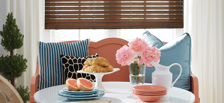
Add Just a Little
Small amounts of color make a big statement. While this contemporary space is full of neutrals, it exudes calm cheerfulness by using pops of 2016’s color of the year pairing. Of course the pink chandelier is the showpiece of the room. While making a bold statement, it also adds elegance and joy. Continuing to infuse whimsical cheer, the soft pink of the florals flows easily with the eclectic style of the room. Blue comes into the scene through the stripes on the dining chairs. Though they add a touch of seriousness, their composure benefits the look and doesn’t take away from the happiness that abounds in the space. Do you love how little bits of color can make big impressions? We’d love to help you bring fun designs, elegant charm, and the color of the year into your home.
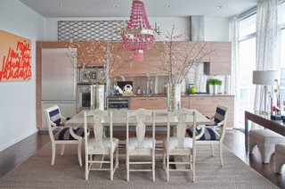
Incorporate More
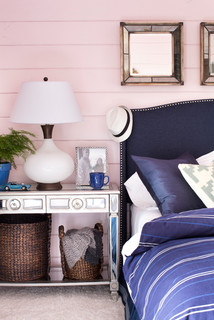
The designers of this room decided to use more than just hints of blue and pink, and they did it brilliantly. Capturing the essence of childhood, while still maintaining a grown-up look, the color of the year duo beautifully defines the space. The mix of pink and blue radiates charm, refreshment, and serenity–just what you want in a bedroom. While the colors form the foundation, thoughtfully chosen accents and personal effects add the finishing touches and enhance the mood. The black and white photo, child’s fedora, and toy car speak to the past, while the metallic side table and mirrors give a nod to modern life. Want the look and feel of this room in your own home? Talk to our design experts and be ready to turn your sweet dream into a stunning reality.
Go All Out
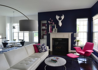
While Pantone’s color of the year choice features pastel shades, no one’s stopping you from doing something fabulously bold. To springboard off Pantone’s concept of contrasting pink and blue, this living space is a spectacular example of how the colors can work together to create a look that’s both upscale and fun. The dark blue wall is a sophisticated backdrop for showcasing the hand-selected accents–like the hot pink chair, white faux deer head, and textured throw pillows. Beyond that, a sense of vibrancy permeates the space, yet the whole scene feels flawlessly composed. The amount of light entering the space offers an airy feel, but can easily be diffused with the roller shades they have chosen. Are you imagining ways to enhance the style and design of your own rooms by using the color of the year pairing as a jumping-off point? Then get in touch with us, and we’ll help you in every way we can!
Excitement abounds in the design world over Pantone’s radical decision for the color of the year, and designers are likely already brainstorming how they’ll incorporate Serenity and Rose Quartz into their work. Are you imagining ways to use them in your home? Are you feeling inspired by the new trend Pantone has started. Here at Timan Window Treatments, we’re eagerly anticipating what designers will dream up in 2016. We’re also looking forward to helping you achieve the incredible look you’re envisioning, and window treatments are a big part of that. So, contact us for a free, in-home consultation.